Part 6 - Visualizing the Results With the IDE
6.1 Visualizing output scalars and vectors
The OMNeT++ IDE can help you analyze your results. It supports filtering, processing, and displaying scalar, vector, and histogram data. The following diagrams have been created with the Result Analysis tool of the IDE.
The results directory in the project folder contains .vec and .sca files, which are the files that store the results in vector and scalar form, respectively.
Vectors record data values as a function of time, while scalars typically record aggregate values at the end of the simulation.
To open the Result Analysis tool, double click on either the .vec or the .sca files in the OMNeT++ IDE. Both files will be loaded by the Result Analysis tool.
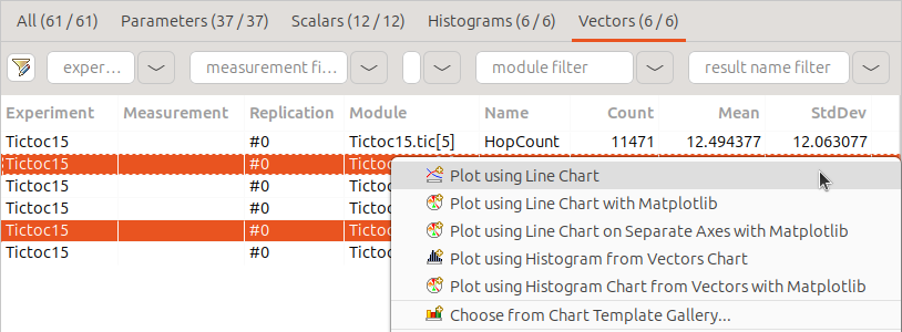
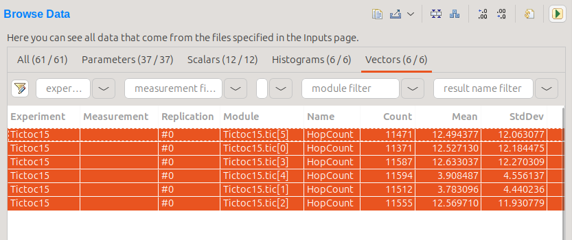
You can find the Browse Data tab at the bottom of the Result Analysis tool panel. Here you can browse results by type by switching the various tabs
at the top of the tool panel, ie. Scalars, Vectors, Statistics, or Histograms. By default, all results of a result type are displayed. You can filter them by the module filter
to view all or some of the individual modules, or the statistic name filter to display different types of statistics, ie. mean, max, min, standard deviation, etc.
You can select some or all of the individual results by highlighting them. If you select multiple results, they will be plotted on one chart. Right click and select one of the Plot using ... menu items to display the figures.
Tip
For further information about the charting and processing capabilities,
please refer to the OMNeT++ Users Guide (you can find it in the doc directory of the OMNeT++ installation).
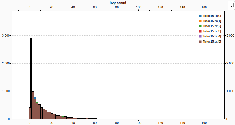
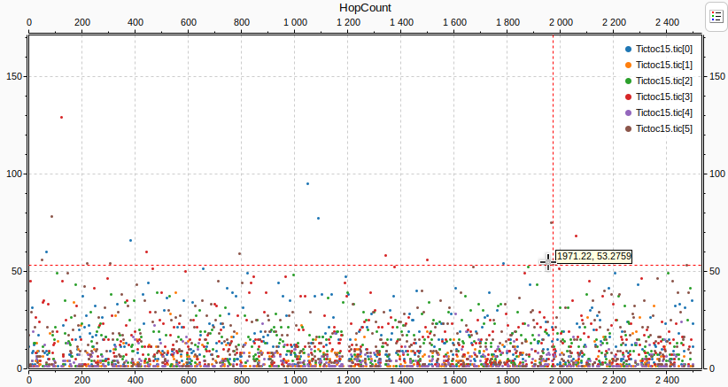
Our last model records the hopCount of a message each time the message
reaches its destination.
To plot these vectors for all nodes, select the 6 lines in the browse data tab,
then right click and select Plot using Line chart.
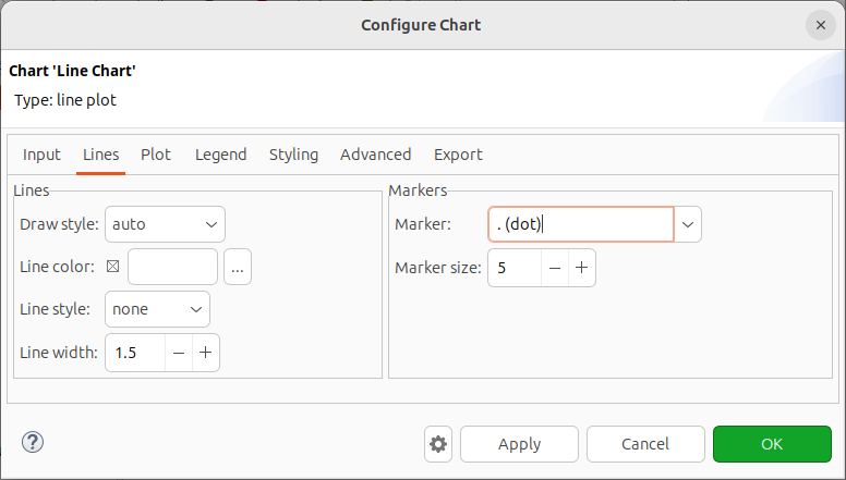
We can change various options about how the data on the chart is displayed. Right click on the chart background, and select Configure Chart. In the appearing dialog, on the Lines tab, set Line style to none, and Marker to . (dot).
The chart looks like the following:
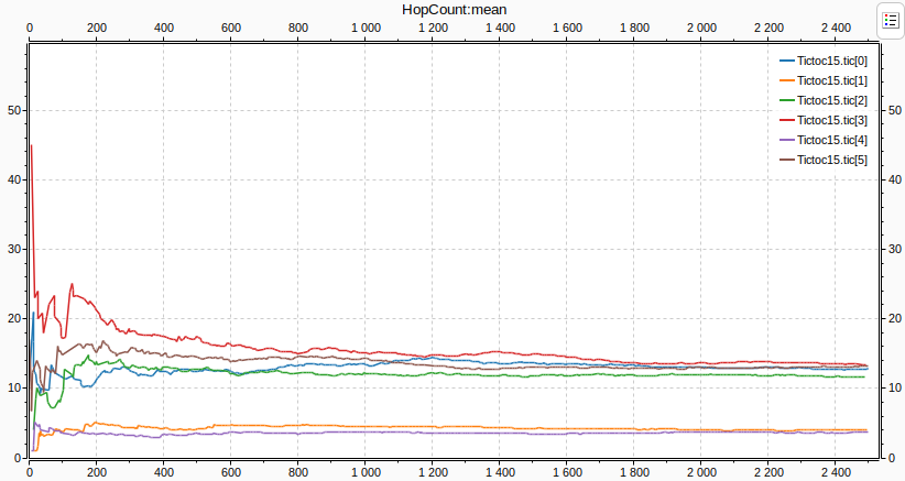
If we apply a mean operation we can see how the hopCount in the different
nodes converge to an average.
Right-click the chart, and select Apply... -> Mean.
Again, right-click on the chart background, and select Configure Chart.
In the Lines tab, set Line style to solid, and Marker to none.
The mean is displayed on the following chart. The lines are easier to see this way because they are thinner.
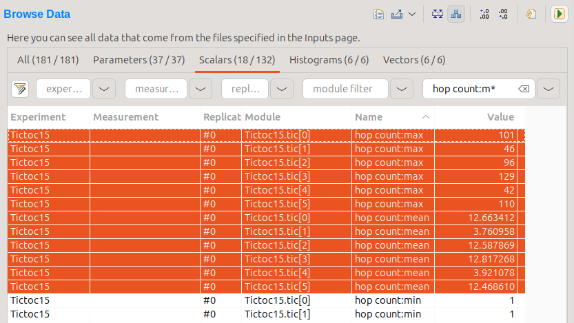
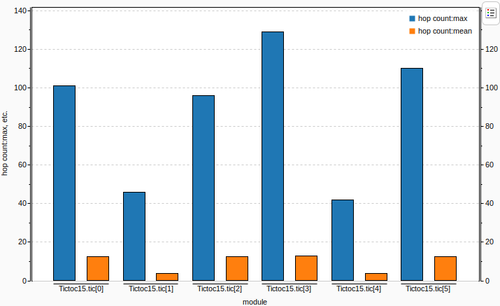
Scalar data can be plotted on bar charts.
The next chart displays the mean and the maximum of the hopCount of the messages
for each destination node, based on the scalar data recorded at the end of the simulation.
In the Browse data tab, select Scalars, and make sure that the Show Statistics/Vector Fields as Scalars
button is enabled on the top-right toolbar. Now select hop count:max and hop count:mean for all 6 nodes.
You can use filtering and sorting to find the scalars easier, as shown below.
This is how the chart looks like:
To create a histogram that shows hopCount's distribution, select Histograms
on the Browse Data tab. Select all rows, then right click, and choose Plot using Histogram Chart.