Analyzing the Results
Overview
Analyzing simulation results is crucial for validating models and understanding their behavior. The Analysis Tool in the IDE is an editor that edits an analysis (.anf) file. The analysis file captures the set of inputs and the processing steps necessary for creating the desired plots and tables.
In OMNeT++, the results of simulations are captured as scalar values, vector values, statistic summaries (hereafter just “statistics”), and histograms, and are recorded into result files. Result files are tagged with metadata like the network name, iteration variables, and configuration settings. The analysis typically begins with the user specifying a set of result files either directly by name or through patterns that match multiple files. Once loaded, these results can be explored through an intuitive interface where users can browse, filter, transform, and visualize data using various chart types.
Charts can be opened from the selected data with a few clicks. Charts use queries in the form of filter expressions to select the desired subset of results. Users can refine these expressions or write new ones to tailor the data being visualized. The plotting capabilities range from using Matplotlib for complex visualizations to employing the IDE’s own Native Plots for more straightforward, interactive displays. Each chart allows adjustments such as labels, colors, line styles, and other visual properties through a configuration dialog.
The charts and their associated settings are remembered as part of the analysis (.anf) file. When the user re-runs the simulations due to modifications in simulation configurations or model adjustments and a new set of result files is created, the analysis tool can automatically fill or refresh the charts with new data.
Each chart in the analysis tool is backed by a customizable Python script and a set of properties that can be edited through a chart configuration dialog. The IDE allows users to edit the chart script to fit their precise needs, to add or modify properties, and even update the configuration dialog to accommodate additional inputs.
Finally, the analysis results can be reproduced and utilized outside the IDE
through opp_charttool, a command-line tool that recreates chart
views from the analysis files. This capability facilitates the integration of
results into batch processes, such as compiling LaTeX articles, or sharing them
for independent review. Detailed information on this tool and its
functionalities is provided in the Simulation Manual, offering a comprehensive
framework for managing simulation outputs.
Creating Analysis Files
The usual way of creating an analysis file is to “imitate” opening an OMNeT++
result file (.sca or .vec) by double-clicking it in the
Project Explorer view. Result files cannot be opened directly, so
the IDE will offer creating an analysis file for it instead.
If the result file name looks like the file was created as part of an experiment
or parameter study, the IDE creates an analysis file that includes all result
files from that experiment as input. In the resulting inputs, the variable part of
the file name will be replaced by an asterisk (*), and an input will be
added with both the .sca and .vec file extensions. For example,
double-clicking a file called PureAloha-numHosts=10,iaMean=1-#3.sca
will add PureAloha-*.sca and PureAloha-*.vec to the analysis.
Upon double-clicking, the New Analysis File dialog will open. The folder and the file name are pre-filled according to the location and name of the result file. Press Finish to create the new analysis file.
The same dialog is also available from the menu as . However, analysis files created that way will contain no reference to result files, so file name patterns will need to be added later.
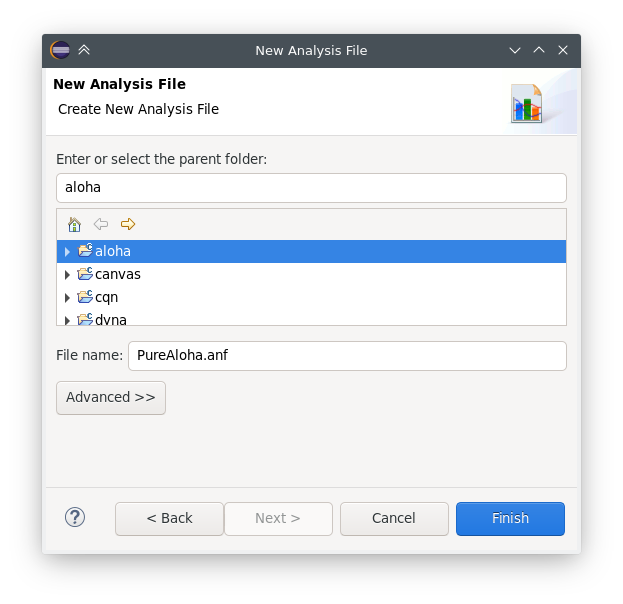
Fig. 151 New Analysis File dialog
Tip
If the analysis file already exists, double-clicking on the result file will open it.
Opening Older Analysis Files
The format of the analysis files (*.anf) has changed in OMNeT++ 6.0 in a
non-backward compatible way, meaning that older OMNeT++ versions will not be
able to open new analysis files. OMNeT++ 6.0, however, attempts to open and
convert analysis files created by older versions. Keep in mind that the
conversion is a “best-effort” attempt: the result may be incomplete or incorrect.
Always check that the converted charts indeed correspond to the original ones, and
refine the result if needed.
Using the Analysis Editor
The usual workflow of result analysis consists of a few distinct steps. These are: adding input files to the analysis, browsing simulation results, and selecting those of interest, creating a chart of an appropriate type from the results, then viewing them as plots, and finally exporting data and/or images if needed.
The Analysis Editor is implemented as a multi-page editor. What the editor edits is the “recipe”: what result files to take as inputs, and what kind of charts to create from them. The pages (tabs on the bottom) of the editor roughly correspond to some of the steps described above.
In the next sections, we will go through the individual pages of the editor and which analysis steps can be performed using them.
The Inputs Page
The first page in the editor is the Inputs page, where you specify input files for analysis. You can add a set of file name patterns that specify which result files to load. When the IDE expands the patterns, it displays the list of matched files under each one. The contents of files are also displayed in a tree structure.
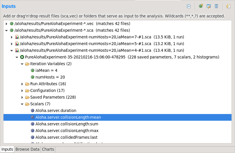
Fig. 152 The Inputs page
New input files can be added to the analysis by dragging vector and scalar files from the Project Explorer view, or by opening a dialog with the New Input button on the local toolbar.
Resolution Rules
Input file patterns are resolved with the following rules:
An asterisk (
*) matches files/folders within a single folder.A double asterisk (
**) may match multiple levels in the folder hierarchy.If the pattern starts with a slash (
/), it is understood as a workspace full path, with its first component being a project name.If the pattern does not start with a slash (
/), it is interpreted as relative to the folder of the analysis file.If the pattern identifies a folder, it will match all result files in it (i.e.
/foo/resultsis equivalent to/foo/results/**.scaplus/foo/results/**.vec).
Refresh Files
The input files are loaded when the analysis file is opened.
If files change on the disk or new files are created while the analysis is open (for example, because a simulation was re-run), a refresh can be triggered with the Refresh Files button on the toolbar. Refresh Files expands the file name patterns again, then loads any new matching files, unloads files that no longer exist on the disk, and reloads the files that have changed since being loaded. Open charts are also refreshed.
Note
In the design of the Analysis Tool, it was a conscious choice to opt for explicit reload in favor of an automatic one. Automatic reload would make it difficult to look at partial results due to excessive refreshing while a large simulation campaign is underway, or when a simulation is continually writing into a loaded vector file.
Reload Files
It is also possible to let the Analysis Tool completely forget all loaded result files, and have them reloaded from scratch. The functionality is available from the context menu as Reload All Files.
Are Files Kept in Memory?
The contents of scalar files are loaded in memory.
Vector files are not loaded directly; instead, a much smaller index file
(*.vci) is created and the vector attributes (name, module, run, statistics,
etc.) are loaded from the index file. The index files are generated during the
simulation, but can be safely deleted without loss of information. If the index
file is missing or the vector file was modified, the IDE rebuilds the index in
the background.
Tip
The Progress view displays the progress of the indexing process if it takes a long time.
The Browse Data Page
The second page of the Analysis editor displays results (parameters, scalars, histograms, and vectors) from all files in tables and lets the user browse them. Results can be sorted and filtered. Simple filtering is possible with combo boxes, or when that is not enough, the user can write arbitrarily complex filters using a generic pattern-matching expression language. Selected or filtered data can be immediately plotted.
Tip
You can switch between the All, Parameters, Scalars, Histograms, and Vectors pages using the underlined shortcuts (Alt+letter combination) or the Ctrl+PgUp and Ctrl+PgDown keys.
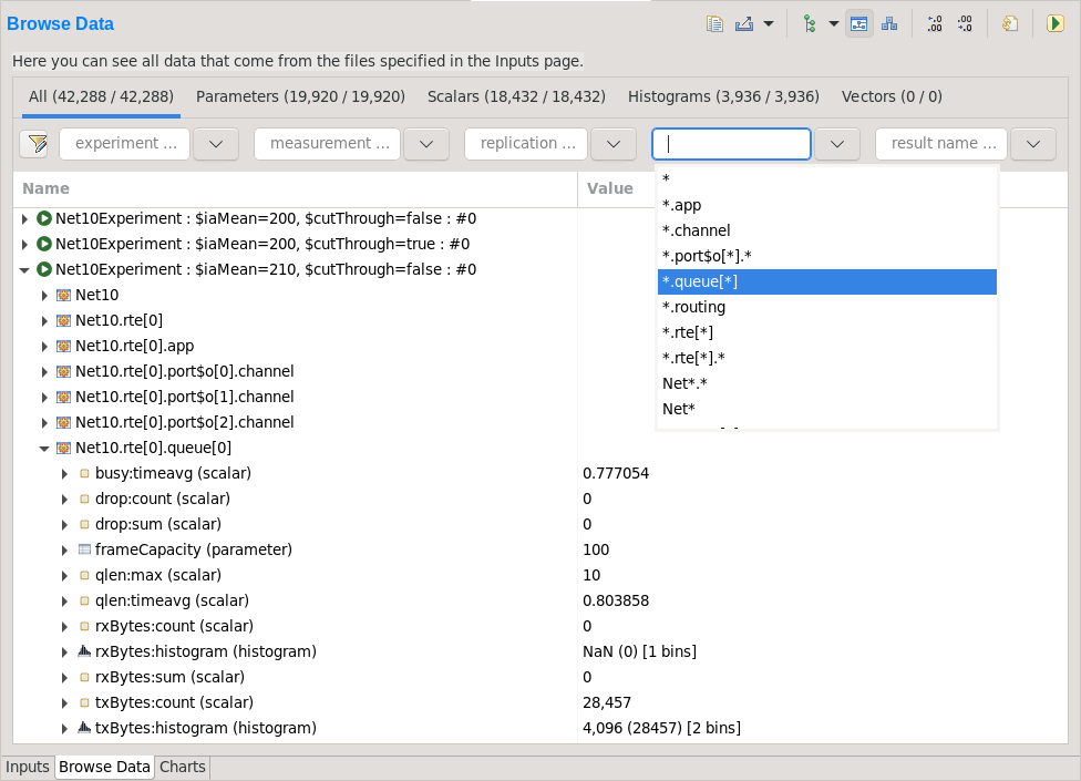
Fig. 153 Browsing all data generated by the simulation
The All tab shows a tree containing all loaded result items. The structure of this tree can be altered with the Tree Levels and Flat Module Tree options on the local toolbar and in the context menu.
The other tabs show tables containing the values and attributes of all results of the given type. To hide or show table columns, open Choose table columns from the context menu and select the columns to be displayed. The settings are persistent and applied in each subsequently opened editor. The table rows can be sorted by clicking on the column name.
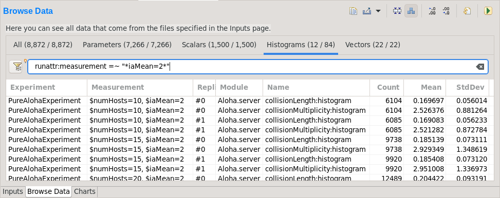
Fig. 154 Browsing a subset of result items selected using a filter expression
Individual fields of composite results (e.g. the :mean and :count fields of statistics, histograms, or vectors) can also be included as scalars by enabling the Show Statistics/Vector Fields as Scalars option.
Filtering
Filtering of the table contents is possible with the combo boxes above the tables. The strings in the combo boxes may contain wildcards, and the combo boxes also support content assist (Ctrl+SPACE), both of which are useful if there are a huge number of items with different names.
If a more sophisticated selection criteria is needed, it is possible to switch to a more generic filter expression. After pressing the Filter Expression button in the filter row, you can enter an arbitrary filter expression. The expression language is described in section Filter Expressions.
Plotting
You can display the selected data items on a chart. To open the chart, choose one of the Plot items from the context menu, or press Enter (double-click also works for single data lines). See section Basic Chart Usage for more information.
Viewing the Details of Result Items
To see the properties of the selected result item, open the
Properties view. This is useful for checking properties that are not
displayed in the table, such as result attributes (title, unit,
interpolationmode, etc.), or the full list of bins of a histogram.
Viewing the Contents of a Vector
When selecting a vector, its data can also be displayed in a table. Make sure that the Output Vector view is opened. If it is not open, you can open it from the context menu (Show Output Vector View). This view always shows the contents of the selected vector.
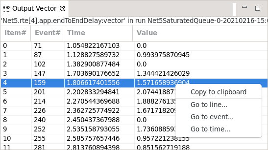
Fig. 155 The Output Vector View With its Context Menu
Exporting Data
Selected results can be exported to files in different data formats using the Export Data context menu option. After selecting the data format, a dialog to select the output file and configure additional exporting options is shown.
A variety of formats is available, including two CSV-based ones (CSV-R for programmatic consumption and CSV-S for loading into spreadsheets), SQLite, JSON, and so on. Vectors can be also cropped to a time interval in the export.
Tip
You can switch between the Inputs, Browse Data, and Charts pages using the Alt+PgUp and Alt+PgDown keys.
The Charts Page
The third page displays the charts created during the analysis.
This page works much like a usual graphical file manager. Each icon represents a chart, and the charts can be selected, reordered by dragging, copied, pasted, renamed, deleted, opened, or their context menu accessed. Different view modes like “icon” and “list” module can be selected.
The Charts page also enables you to organize your charts into “folders,” providing a more structured and accessible view. This is especially useful when managing a large number of charts.
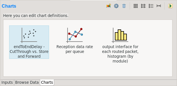
Fig. 156 Charts Page
The Outline View
The Outline view shows an overview of the current analysis. Clicking on an element will select the corresponding element in the editor.
Tip
If you select a chart that is currently open, the editor will switch to its page in the editor instead of selecting it in the Charts page. If there are many charts open, this can actually be a more convenient way of switching between them than using the tabs at the bottom of the editor window.
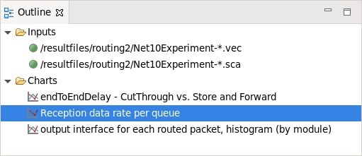
Fig. 157 Outline View of the analysis
Basic Chart Usage
This section introduces you to the basics of working with charts in the OMNeT++ IDE. It shows how to navigate plots, configure their appearance, and export data and images.
Charts can be created in two ways: first, based on the set of selected results on the Browse Data page, and second, choosing from the list of available chart types on the Charts page.
Plotting Data
Most often, a new chart is created from a set of simulation results displayed on the Browse Data page.
To visualize data, first identify the set of simulation results you wish to plot. By double-clicking on a result item or selecting multiple results and pressing Enter, the editor will automatically open an appropriate chart. Alternatively, you can right-click on the selected results to access a context menu that offers a selection of chart templates compatible with the chosen data.
For a more detailed view, select the Choose from Template Gallery context menu option. This displays a curated list of templates – filtered to only show those suitable for your data – in the gallery dialog. Here, each template is accompanied by a description and screenshots, providing a comprehensive preview.
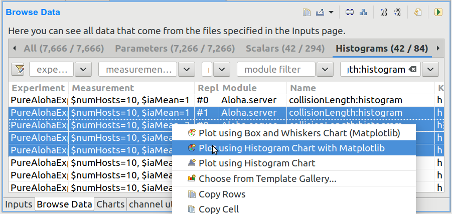
Fig. 158 Plotting the selected results
Charts opened this way are temporary charts, designed to allow users the flexibility to explore simulation results and their various visualizations without permanent commitment. If you find a chart that provides valuable insights and wish to keep it for ongoing analysis, you can preserve it by selecting Save Chart from the toolbar or the context menu of the chart’s page. Once saved, the chart will then be listed on the Charts page, making it a permanent part of your analysis.
If you have many charts open, it is easy to lose track of which ones have already been saved into the analysis. To identify if an open chart is temporary, look for the Save Chart icon on the leftmost part of the local toolbar. This icon indicates that the chart is temporary. Conversely, if you see the Go To Chart Definition icon, the chart has been saved as part of your analysis. Clicking this button will direct you to the Charts page, where the saved chart is displayed.
Tip
After saving a temporary chart, it is recommended that you check the filter expression on the Inputs page of the chart configuration dialog, and refine or simplify it as needed. When the temporary chart is created, the IDE generates a filter expression based on the selection, but the generated expression is not always optimal, and it may not accurately express your intended selection criteria.
Starting From a Blank Chart
On the Charts page, you can create a new chart by right-clicking in an empty area and selecting a chart template from the New submenu. Simply clicking on an item from this list will create a new chart based on it.
Alternatively, use the New Chart button on the toolbar to open a gallery-like dialog that provides detailed information, including a short description and screenshots, for each chart template. By selecting a template and pressing OK, you will instantiate that template into a new chart.
Charts created using either method will initially be empty, as they have not yet been configured with a result selection filter expression.
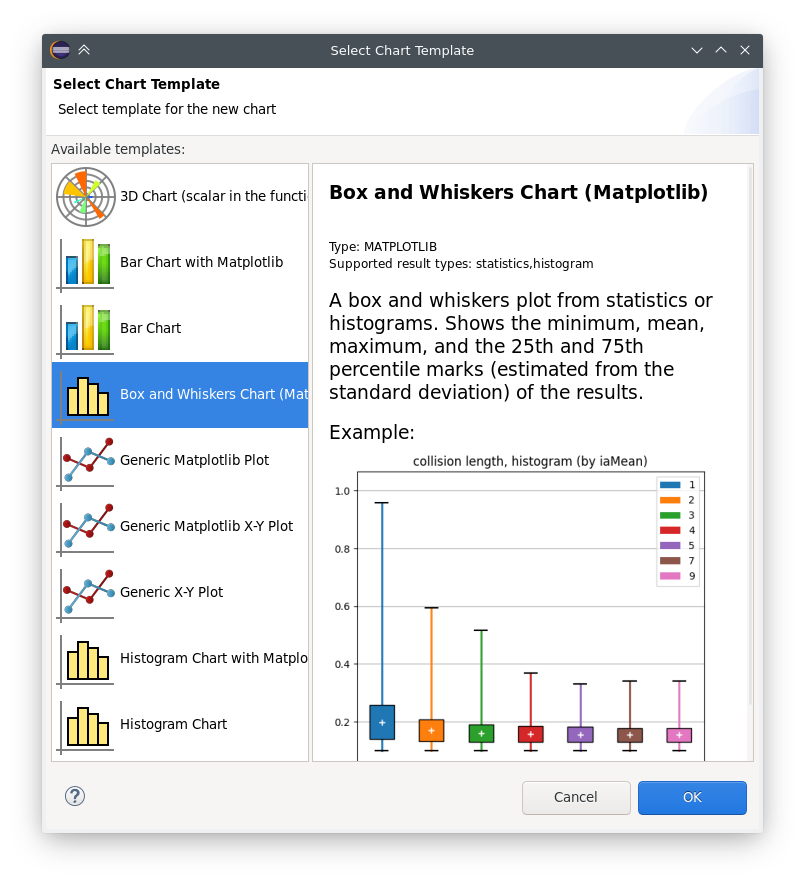
Fig. 159 The chart template gallery dialog
Opening an Existing Chart
To open an existing chart, double-click it in the Charts page, or select it and hit Enter.
Plot Navigation
This section outlines the mouse and keyboard bindings for navigating two types of plots in the Analysis Tool: native plots and Matplotlib-based plots.
Navigation in Native Plots
These plots support two modes, Pan and Zoom, which can be switched using toolbar buttons.
- Pan Mode:
Scroll vertically with the mouse wheel
Scroll horizontally with Shift plus the mouse wheel
Drag the chart (holding the left mouse button) to pan around
Zoom in/out around the cursor with Ctrl plus the mouse wheel
- Zoom Mode:
Zoom in around the cursor by left-clicking
Zoom out by holding Shift and left-clicking
Zoom in/out around the cursor using the mouse wheel
Zoom in on a rectangular area by selecting it by dragging (moving the pointer while holding the left mouse button)
- Additional toolbar buttons are available to:
Zoom in/out horizontally/vertically (4 buttons)
Reset original view
Navigation in Matplotlib Plots
Navigation in Matplotlib plots generally follows standard Matplotlib interactions but includes a few enhancements for better control.
- The following mouse wheel gestures are always available:
Scroll vertically with the mouse wheel
Scroll horizontally with Shift plus the mouse wheel
Zoom in/out around the cursor with Ctrl plus the mouse wheel
These plots support three modes, Pan, Zoom, and Interaction, which can be switched using toolbar buttons.
- Pan Mode:
Pan by dragging the mouse, holding the left button
Zoom in/out by dragging the mouse, holding the right button
To make zooming and panning only affect one of the axes, hold the X or Y key
To keep the aspect ratio while zooming, hold Ctrl
- Zoom Mode:
Zoom in on a selected rectangular area by dragging (moving the pointer while holding the left mouse button)
Zoom out to fit the current view into a selected rectangular area by right-click dragging (holding the right mouse button while moving the pointer)
To make zooming only affect one of the axes, hold the X or Y key
- Interaction Mode:
This mode lets you interact with plots that include active elements like sliders, buttons, and other widgets.
- Additional toolbar buttons are available to:
Reset original view
Back to previous view
Forward to next view
Delta Measurement
Both native and Matplotlib line plots support delta measurement, allowing you to measure the horizontal and vertical distance between two points on a plot. This feature is activated using keyboard shortcuts when the mouse cursor is over the plot area.
- Setting the Start Point:
Press A near a data point or line segment vertex to set it as the start point (marked with a solid circle).
Pressing A again near the same point clears the start point.
Pressing A near a different point moves the start marker there.
- Setting the End Point:
Press D near a data point or line segment vertex to set it as the end point (marked with a dotted circle).
Pressing D again near the same point clears the end point.
Pressing D near a different point moves the end marker there.
- Selecting a Segment:
Press S near a line segment to set its endpoints as the start and end points simultaneously.
Pressing S again near the same segment clears both points.
- Clearing Measurement:
Press X to clear both the start and end points and remove the markers.
When one or both points are selected, markers appear on the plot. If only one point is selected, its coordinates are displayed. If both points are selected, their coordinates and the delta values between them are displayed. The selection mechanism finds the nearest point or segment within a small threshold (around 10 pixels). For plots with step interpolation, the corners of the steps are also considered valid points for selection.
The Chart Properties Dialog
Charts have a set of properties that define their behavior and appearance. These properties can be edited in a configuration dialog, accessible from the Configure Chart toolbar button and context menu item.
The dialog has a tabbed layout, where the list of tabs and the form on each page differ for each chart type. Pages that are common to nearly all chart types (albeit with slightly differing contents) are:
Input: Defines which simulation results should be used as input for the chart and their roles (e.g., which ones to use for the horizontal axis, iso lines, etc.).
Plot, Lines, Bars, etc.: For configuring the labels, markers, ticks, grid, etc.
Styling: Visual properties for the plot.
Advanced: Lets you manually add plot properties that are not configurable on the other pages.
Export: Properties to be used during image/data export.
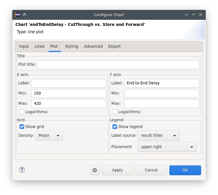
Fig. 160 The Chart Properties Dialog
For many input fields, autocompletion and smart suggestions are available by pressing Ctrl+SPACE.
Exporting Data
Both the input data used by a chart and the final result after processing can be exported.
The first one is essentially the same as the result exporting option on the Browse Data page, except that it uses the result filter expression of the given chart to select which results to export. This is available under the Export Chart Input As context menu item of charts.
The second one is available under the common Export Chart option, as discussed in section Batch Export.
Exporting Images
There are multiple, significantly different ways of exporting a chart to an image:
You can copy the chart to the clipboard by selecting Copy to Clipboard from the context menu. The chart is copied as a bitmap image the same size as the chart on the screen, taking the current navigation state into account.
The Save Image option saves the currently shown part of the chart to an image file. Popular raster and vector formats are accepted, including PNG, JPG, SVG, GIF, TIFF, etc.
Finally, the Export Chart option opens the combined image/data exporting dialog (see section Batch Export) for this chart only. This option relies on the chart script for doing the actual exporting.
Batch Export
When exporting multiple charts or when selecting the Export Chart option for a single chart, a common export dialog is opened.
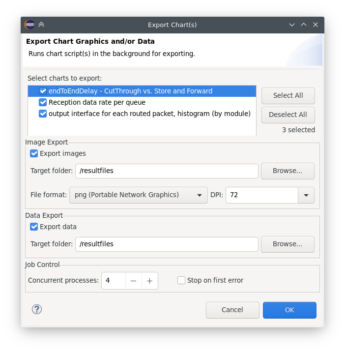
Fig. 161 Export Charts Dialog
Individual file names and image dimensions can be specified for each chart in their respective chart configuration dialog.
Note that native charts exported this way will be emulated with Matplotlib, so the saved images may look a bit different than in the IDE.
This is also the way opp_charttool exports charts from the command line.
Configuring Charts
This section discusses working with charts in more detail.
Available Chart Types
The Analysis Tool offers two distinct methods for displaying plots:
Matplotlib: Utilizes the full functionality of Matplotlib within the IDE, allowing for the creation of virtually any type of plot.
Native Plots: Although limited to bar, line, and histogram plots, these widgets are more responsive and scalable compared to Matplotlib.
Chart templates can be categorized according to whether they use native plot widgets for displaying the plot or Matplotlib. It is usually indicated in the name of a chart type whether it is Matplotlib-based or uses a native plot.
There are a number of chart templates in the library of the Analysis Tool. We list the most frequently used ones below.
Based on Native Plots:
Line Chart: Plots vector results as line charts, with the native plot widget. The default interpolation mode is determined automatically from the result attributes. Many kinds of vector operations (smoothing, accumulating, mathematical formulas, etc.) can be easily performed on the vector data. Interpolation, markers, and line style can be configured. Hovering over legend entries with the mouse highlights the corresponding series, clicking on the labels hides/shows the series.
Scatter Chart (Scalars in the Function of Itervars): Displays scalar results on scatter plots, using the native plot widget. X-axis values are taken from a numeric iteration variable. Optionally, results can be grouped into series by iteration variables, run attributes, or result attributes. Markers and line style can be configured. Hovering over legend entries with the mouse highlights the corresponding points/iso line, clicking on the labels hides/shows the points/iso line.
Bar Chart: Plots scalar results as a bar chart, with the native plot widget. The bars can optionally be grouped. Individual bars in each group can be stacked, or positioned in different ways. Hovering over legend entries with the mouse highlights the corresponding data series, clicking on the labels hides/shows the series.
Histogram Chart: Plots histogram results with the native plot widget. The drawing style can be filled or outline. Transformations to cumulative and normalized forms are available. Hovering over legend entries with the mouse highlights the corresponding histogram, clicking on the labels hides/shows the histogram.
Histogram from Vectors Chart: Plots histograms from vector results with the native plot widget. The drawing style can be filled or outline. Transformations to cumulative and normalized forms are available. Hovering over legend entries with the mouse highlights the corresponding histogram, clicking on the labels hides/shows the histogram.
Their Matplotlib equivalents:
Line Chart with Matplotlib: Plots vector results as line charts, with Matplotlib. The default interpolation mode is determined automatically from the result attributes. Many kinds of vector operations (smoothing, accumulating, mathematical formulas, etc.) can be easily performed on the vector data. Interpolation, markers, and line style can be configured.
Scatter Chart with Matplotlib (Scalar in the Function of Itervars): Plots scalar results as scatter charts, using Matplotlib, with the X-axis values taken from a numeric iteration variable. Optionally, results can be grouped into series by iteration variables, run attributes, or result attributes. Markers and line style can be configured. Confidence intervals of averaged points are drawn as error bars.
Bar Chart with Matplotlib: Plots scalar results as a bar chart, with Matplotlib. The bars can optionally be grouped. Individual bars in each group can be stacked, or positioned in different ways. Confidence intervals are displayed as error bars.
Histogram Chart with Matplotlib: Plots histogram results with Matplotlib. The drawing style can be filled or outline. Transformations to cumulative and normalized forms are available.
Histogram Chart from Vectors with Matplotlib: Plots histograms from vector results with Matplotlib. The drawing style can be filled or outline. Transformations to cumulative and normalized forms are available.
Since Matplotlib has vastly more possibilities than the native plots, there are some additional Matplotlib-based charts:
Box and Whiskers Chart (Matplotlib): A box and whiskers plot from statistics or histograms. Shows the minimum, mean, maximum, and the 25th and 75th percentile marks (estimated from the standard deviation) of the results.
Line Chart on Separate Axes with Matplotlib: Plots vector results as line charts, with Matplotlib, each on its own axes. This is very similar to the regular “Line Chart with Matplotlib” template; the only difference is that every vector is drawn into its own separate coordinate system, arranged in a column, all sharing their X axes. The default interpolation mode is determined automatically from the result attributes. Many kinds of vector operations (smoothing, accumulating, mathematical formulas, etc.) can be easily performed on the vector data. Interpolation, markers, and line style can be configured.
3D Chart (Scalar in the Function of Itervars): Plots a scalar result with respect to two iteration variables as a 3D chart. Data points can be rendered as bars, points, or a surface. Various color maps can be chosen.
Generic charts, which can serve as a starting point for custom plots:
Generic Matplotlib Plot: An almost blank template using Matplotlib. It only contains an example script, which you are expected to replace with your own code.
Generic Matplotlib X-Y Plot: An example line plot using Matplotlib. It only contains an example script, which you are expected to replace with your own code.
Generic X-Y Plot: An example line plot using the native plot widget. It only contains an example script, which you are expected to replace with your own code.
The configuration dialog is a little different for each chart type, but they are structured similarly and there are a lot of similarities. The next sections detail how to configure the charts.
Remember that it is straightforward to create new chart templates by customizing existing charts (its chart script and/or the dialog pages) and saving them as a chart template. See the Editing the Chart Script, Editing Dialog Pages, and Custom Chart Templates sections for details.
Defining the Chart Input
Defining the input for the chart is the first step in the process of producing the desired plot. It is normally done on the Inputs page of the chart dialog.
The filter expression is the most prominent field on the Inputs
page. It selects from the results loaded into the analysis, that is, from the
contents of the result files selected on the Input page of the
editor. The filter expression can be as simple as module =~ "*.host[*].app[*]"
AND name =~ "pkLatency:mean" for selecting the mean packet latencies from all
apps in the network, or can be composed of many more selectors combined with
AND, OR, and parentheses. The detailed syntax of the filter expression
is described in the section Filter Expressions.
The filter expression is normally used in a results.get_vectors(),
results.get_scalars(), or results.get_statistics() call in the chart
script. To see the result of the query in the Console view, add the
print(df) line after the call in the chart script (see “Editing the chart
script” section).
In charts working from vector input, the Inputs dialog page allows
specifying a crop interval and the possibility to leave out empty vectors from
the result. These options are implemented as additional arguments to
results.get_vectors().
Charts that work from scalar input contain the Include fields
checkbox, that allows the filter expression to match various fields (min, max,
mean, stddev, etc.) of recorded statistics. (Use the Show fields as
scalars button on the Browse Data page to see them.) This is also
implemented as an additional argument to results.get_scalars().
To include additional input, modify the Python script to add your own data. Use cases: To use multiple filter expressions (and combining the results); to add external reference data; to compute new scalars from vectors or other scalars as input.
After executing a result query, most charts require additional processing before the data can be visualized. Charts utilizing scalar data typically involve a pivoting step, while those working with vector data may incorporate vector operations such as summation, computing running averages, or window averages. Details on pivoting and vector operations will be covered in subsequent sections. However, we will first explore the syntax of the filter expression in detail.
Filter Expressions
Filter expressions are primarily used on the Input page of chart dialogs for selecting simulation results as input for the chart. They can also be used on the Browse Data editor page for filtering the table/tree contents, and they also appear, in more generic forms, in other parts of the IDE.
A filter expression is composed of terms that can be combined with the AND,
OR, NOT operators, and parentheses. A term filters for the value of some
property of the item and has the form <property> =~ <pattern>, or simply
<pattern>. The latter is equivalent to name =~ <pattern>.
A typical example is to select certain simulation results recorded by specific
modules. For example, the expression module =~ "**.app[*]" AND name =~
"pkRecvd*" selects results whose name begins with pkRecvd from modules
whose name is app[0], app[1], etc.
Patterns only need to be surrounded with quotes if they contain whitespace or other characters that would cause a parsing ambiguity.
- Here is the full list of available properties:
name: Name of the result or item.module: Full path of the result’s module.type: Type of the item. The value is one of:scalar,vector,parameter,histogram,statistics.isfield:trueif the item is a synthetic scalar that represents a field of a statistic or a vector,falseif not.file: File name of the result or item.run: Unique run ID of the run that contains the result or item.runattr:<name>: Run attribute of the run that contains the result or item. Example:runattr:measurement.attr:<name>: Attribute of the result. Example:attr:unit.itervar:<name>: Iteration variable of the run that contains the result or item. Example:itervar:numHosts.config:<key>: Configuration key of the run that contains the result or item. Example:config:sim-time-limit,config:**.sendIaTime.
- In the values, the match pattern may contain the following wildcards:
?matches any character except ‘.’*matches zero or more characters except ‘.’**matches zero or more characters (any character){a-z}matches a character in range a-z{^a-z}matches a character not in the range a-z{32..255}any number (i.e., sequence of digits) in the range 32..255 (e.g.,99)[32..255]any number in square brackets in the range 32..255 (e.g.,[99])\\takes away the special meaning of the subsequent character
Tip
Content Assist is available in text fields where you can enter filter expressions. Press Ctrl+SPACE to get a list of appropriate suggestions at the cursor position.
Pivoting
Charts utilizing scalar data, such as bar charts and scatter plots, typically involve a pivoting step, which converts the data from a linear, list-like format into a more structured table format, which is essential for these types of visualizations.
The results.get_scalars() call produces a data frame with the essential
columns module, name (result name), and value, along with additional
columns for potential result attributes and various properties describing the
simulation run. After pivoting along the module and name columns, this
data is transformed so that each module becomes a row, each result name becomes
a column, and the values fill the cells at the intersection of these rows and
columns. If the data includes results from multiple simulations, the values are
averaged to provide a consolidated overview.
Vector Operations
The charts that show vector results offer a selection of operations to transform the data before plotting.
These can be added to the chart under the Apply or Compute context menu items. Both ways of adding operations compute new vectors from existing ones. The difference between them is that Apply replaces the original data with the computation result, while Compute keeps both.
Some operations have parameters that can be edited before adding them.
The operations are added to a field on the Input page of the chart configuration dialog.
Most operations perform a fairly simple transformation on each individual vector independently.
For example, see the screenshots illustrating the effects of the following vector operations:
apply:sum
apply:diffquot
apply:movingavg(alpha=0.05)
The operations apply:sum, apply:diffquot, and apply:movingavg(alpha=0.05)
transform vector data by computing cumulative sums, rate of change between
consecutive values, and applying an exponentially weighted moving average,
respectively.
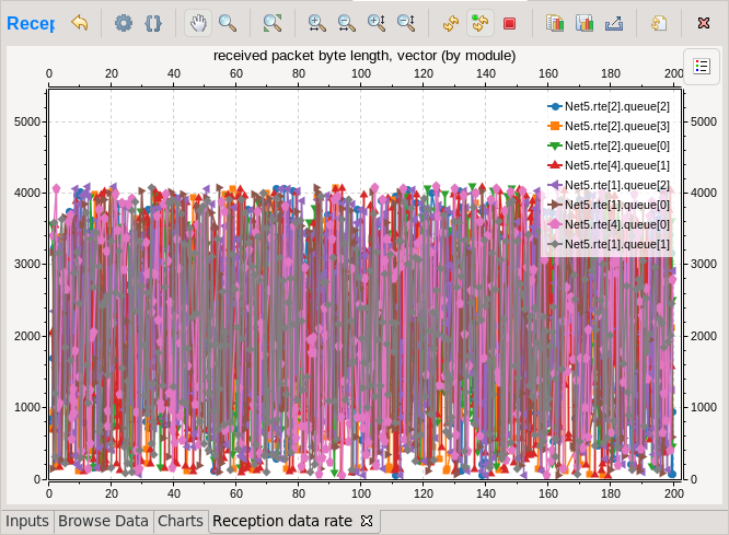
Fig. 162 Vector Operations - Before
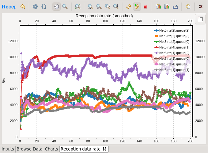
Fig. 163 Vector Operations - After
The list of available operations includes:
mean(): Computes the cumulative average of values up to each point.
sum(): Calculates the cumulative sum of values up to each point.
add(c): Adds a specified constant to all values.
compare(threshold, less=None, equal=None, greater=None): Compares each value against a threshold and replaces it based on specified conditions.
crop(t1, t2): Discards values outside a specified time interval.
difference(): Subtracts each value from its predecessor.
diffquot(): Computes the rate of change between consecutive values.
divide_by(a): Divides all values by a constant.
divtime(): Divides each value by its corresponding time.
expression(expression, as_time=False): Evaluates a Python expression for each value, optionally updating time instead of values.
integrate(interpolation=”sample-hold”): Integrates the series using the specified interpolation.
lineartrend(a): Adds a linear trend to the series.
modulo(m): Applies modulo operation to the series with a constant.
movingavg(alpha): Applies an exponentially weighted moving average to the series.
multiply_by(a): Multiplies all values by a constant.
removerepeats(): Removes consecutive repeated values.
slidingwinavg(window_size, min_samples=None): Computes the average of values within a sliding window.
subtractfirstval(): Subtracts the first value from all subsequent values.
timeavg(interpolation): Computes the average of values over time using the specified interpolation.
timediff(): Calculates the time difference between consecutive values.
timeshift(dt): Shifts the time series by a constant.
timedilation(c): Scales the time series by a constant factor.
timetoserial(): Converts time values to their sequential index.
timewinavg(window_size=1): Computes the average of values within a fixed time window.
timewinthruput(window_size=1): Calculates the throughput over a fixed time window.
winavg(window_size=10): Computes the average of values within each batch of a specified size.
See a description of all built-in vector operations in the Simulation Manual.
Plot Options
The configuration dialogs for charts contain specific pages tailored to customizing the plot:
The Plot page allows setting the plot title, adjusting axis labels, setting axis limits, configuring axis scales (linear or logarithmic), toggling and configuring grid display, and managing legend display and placement.
The Lines page appears in line plots, and allows you to customize plot line attributes such as style, color, and width, and marker characteristics including type and size.
The Bars page appears with bar charts, and allows changing the baseline, the bar placement (aligned, overlap, in-front, or stacked), and details like label rotation.
The Histogram page appears in histogram plots, and allows the user to configure histograms by setting a baseline, choosing between solid or outline draw styles, normalizing data, displaying cumulative results, and managing under/overflows.
The majority of the settings mentioned are straightforward and intuitive; however, there is an important aspect regarding how colors and markers are determined in the plots. Unlike static configurations, the number of data items represented in the plot is dynamic, varying based on the results retrieved by a query. Consequently, colors and markers cannot be assigned directly to each individual data point.
Instead, these visual attributes are managed through “cyclers,” which systematically rotate through a predefined set of colors and markers. This approach ensures an appealing visual representation regardless of the number of data items displayed. To customize the sequence of colors and markers used in Auto mode, you can adjust the cycle seed on the Styling page. This allows for the modification of the appearance of plot elements dynamically, accommodating the varying result sets returned by different queries.
Legend Labels
The labels of data items in the legend are normally produced automatically,
making use of the properties that differ across the data items. (The properties
that are the same in all items are, on the other hand, used for producing the
chart title.) With automatic legend labels, the user is given the choice of
stating the preference between using result names instead of result titles, and
module display paths instead of module full paths. (The result title is the
content of the title attribute of the result. The display path is a variant
of the full path where, if available, the display names of modules are used
instead of the normal names; the display name is set using the display-name
configuration option.)
For those who require more detailed control, the Manual mode allows users to
define a custom format string for the legend labels. This string can include
placeholders like $name, $title, $module. These placeholders refer
to dataframe columns, so the exact list varies depending on the chart type and
the kind of simulation results. When in doubt, insert a print(df) statement
in the chart script and check the log in the Console.
The labels produced like that can be further tweaked using replacements. You can
input plain substrings or regular expressions to be replaced with the strings
you specify. Using this feature, you can achieve things like replacing
abbreviations with full terms, discarding unwanted parts, replacing module names with
more descriptive names, or adjusting separator/punctuation characters or spacing.
For example, the /host\[(\d+)\]/Host \1/ regex replacement will turn strings
like host[0], host[1], etc. into Host 0, Host 1, and so on.
Ordering
Charts normally allow controlling the order of the data items (series) in the plot. The ordering affects both the chart presentation and the legend, enabling users to place important or related items together.
When exporting multiple charts, or when selecting the Export Chart option for a single chart, a common export dialog is opened.
The order is defined via a list of regular expressions that are matched against
the legend labels of the items. The plot items will be ranked based on the index
of the regular expression the item first matches. Case-sensitive substring match
is done, so ^ and $ should be used to match the beginning and end of the
label, respectively. For example, the regex list (router, host) will
place all items whose label contains the “router” string in front of items that
contain “host”, and items that contain neither will follow. The list (^B,
^A) will move items starting with capital “B” to the top, followed by items
starting with capital “A”, and the rest below.
There are two regular expression lists, defining a primary and secondary ordering. The primary ordering takes precedence, and the secondary ordering is used to further refine the arrangement of items that are equivalently ranked in the primary order.
A further checkbox allows users to enable or disable alphabetical sorting as a tertiary ordering mechanism. This is useful when two items do not match any of the specified regular expressions, ensuring that there is still a consistent rule to fall back on for their ordering. When activated, this setting ensures that after considering the regex-based rankings, items will be alphabetically ordered.
Styling
The Styling page of the dialog allows setting a number of options that affect the presentation of the plot.
For Matplotlib-based charts, you can select the plot style. This is the same that you can
select in plain Matplotlib using the matplotlib.style.use(style) command.
There are a number of built-in styles, and you can add new styles by installing
packages like seaborn or prettyplotlib.
You can set the background colors, some legend display options, etc.
You can set the seed used for the color and marker cyclers. Experimenting with different seeds allows you to choose a new set of colors/markers for the plot if you do not like the default ones. If you want to have even more control over the colors and markers, you can define your own cycler and enter it as properties on the Advanced page of the dialog.
The Advanced page enables even more fine-grained customization by allowing users to directly set visual plot properties that are not explicitly configurable in the dialog. For Matplotlib charts, you can enter settings in the format known as “rcParams” in Matplotlib terminology. Native plots have their own visual properties; content assistance in the dialog will help discover them. Native plots also allow directly setting colors for individual items via properties.
Editing the Chart Script
All charts are powered by Python scripts, which take their configuration settings from properties that can be edited in the Chart Configuration dialog. All of these elements are under your full control so that you can create exactly the plots that you need for your analysis: you can edit the chart script, you can edit the properties using the configuration dialog, and you can also modify/tweak the configuration dialog itself to add input fields for extra properties, for example. Each chart has its own copy of everything (the chart script, properties and config dialog pages), so modifying one chart will not affect other similar charts.
Editing
To see or edit the chart’s Python script, click the Show Code Editor button on the toolbar of an open chart. With the code editor open, you are free to make any changes to the chart’s script.
The integrated editor is that of the PyDev project. It provides syntax highlighting, code navigation (go to definition, etc.), helpful tooltips (using docstrings), and content assist (completion suggestions).
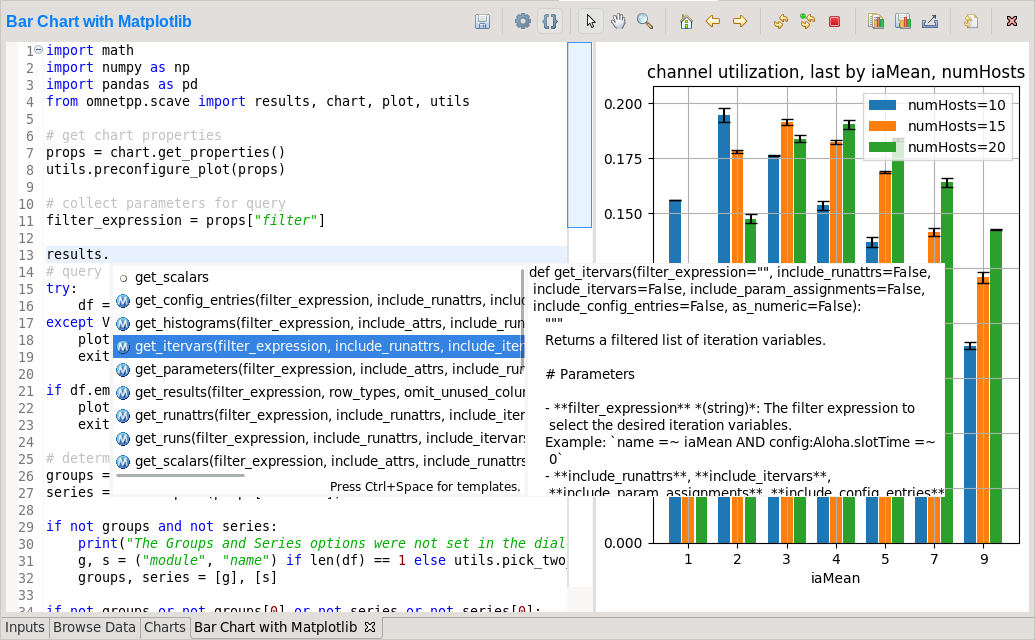
Fig. 164 Chart Script Editor
Refreshing the Chart
Normally, the chart script is automatically re-executed with some delay after each edit. This functionality can be enabled/disabled using the Automatic Refresh button on the chart page toolbar. Independent of the auto-refresh state, you can always trigger a manual refresh (re-execution of chart script) by pressing the Refresh on the toolbar. If the chart script execution takes too long, you can abort it by clicking the Kill Python Process of the Chart button on the toolbar.
Tip
The viewport (zoom/pan state) is usually preserved after refresh. If the area occupied by the displayed data changes significantly for some reason, it is possible that you will see an empty plot after the refresh, simply because valuable content now falls outside the viewport. Push the Home icon on the toolbar in these cases to bring all plotted elements into view.
Console Output
The console output of the script, i.e. text written to the stdout and stderr
streams, is displayed in the Console view. Each chart has a console
of its own in the view, which is activated when switching to the chart’s page in
the editor. Text written to the standard error stream appears in red. You can
write to the console using Python’s print() statement. Notably,
print(df) is a very useful line that you’ll probably end up using quite often.
Note
Even though PyDev offers a variety of tools for debugging Python scripts,
these unfortunately don’t work on chart scripts. Limited debugging can be
performed using print statements, throwing exceptions, and dumping stack traces,
which is usually enough. If you really need debugging to get a piece of code
working, one way is to factor out the code to be able to run independently,
and use an external debugger (or the IDE’s debugger) on the resulting .py file.
Errors
Errors are marked in the source code with a red squiggle and a sidebar icon. Hover over them to see a tooltip describing the error. The errors are also entered into the Problems view. Double-clicking these problem entries will reveal the line in the code editor where the error came from. Errors marked this way include Python syntax errors, and runtime errors that manifest themselves in the form of Python exceptions. For exceptions, the stack trace is printed in the Console view.
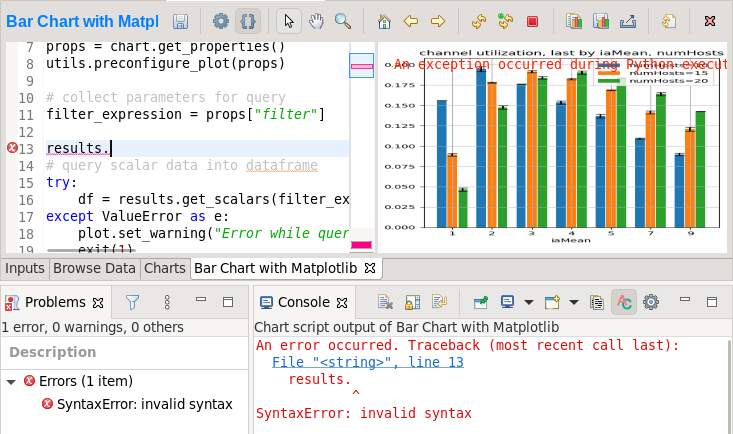
Fig. 165 A Python error is marked on the GUI
Editing Dialog Pages
The Edit Pages Dialog
If you need to add support for new configuration properties to the chart, you will need to edit the forms on the Configure Chart dialog. Pages (tabs) in the configuration dialog are represented as XSWT forms. To see or edit the pages and forms within, click the Edit Dialog Pages button on the property editor dialog.
The action will bring up the Edit Chart Dialog Pages dialog, which lets you edit the forms that make up the configuration dialog of the chart. You can add, remove, reorder, and rename tabs, and you can edit the XSWT form on each tab. A preview of the edited form is also shown.
XSWT Page Descriptions
XSWT is an XML-based UI description language for SWT, the widget toolkit of Eclipse on which the OMNeT++ IDE is based. The content of XSWT files closely mirrors SWT widget trees.
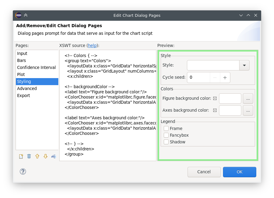
Fig. 166 Editing Chart Properties Editor Pages
The New Page in the dialog brings up a mini wizard, which can create a full-fledged XSWT page from a shorthand notation of its content provided by you.
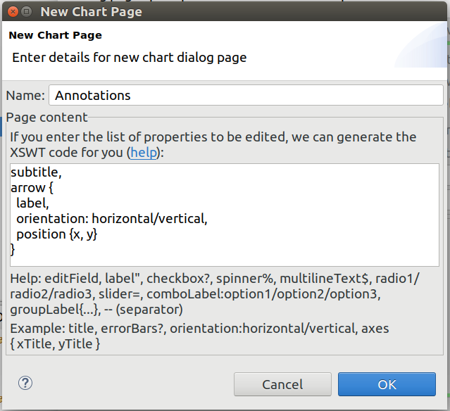
Fig. 167 The Creating a New Dialog Page From a Shorthand Notation
Some XML attributes in the XSWT source have special roles:
x:idbinds the contents of the widget to a chart property. For example, an edit control defined as<text x:id="title">edits thetitlechart property, which can be accessed asprops["title"]in the chart script.x:id.defaultprovides a default value for the chart property named in thex:idattribute.Further
x:id.*attributes are also used, e.g.,x:id.contentAssistdefines the kind of content assist requested for the edit control, orx:id.isEnablerdenotes a checkbox as the enabler of the widget group that contains it.
Tip
The easiest way to add a new field to a page is to look at other pages (or other charts’ pages) and copy/paste from them.
Chart Programming
Data processing in chart scripts is based on the NumPy and Pandas packages, with some modules provided by OMNeT++.
Python Modules
The chart scripts can access some functionality of the IDE through a couple of
modules under the omnetpp.scave package. These include: chart,
results, ideplot, vectorops, and utils. The complete API of
these modules is described in the Simulation Manual.
The chart module exposes information about the chart object (as part of the
analysis, and visible on the Charts page), most importantly its set
of properties but also its name and what type of chart it is.
The results module provides access to the set of result items (and
corresponding metadata) currently loaded in the analysis in the IDE. This data
is accessible through a set of query functions, each taking a filter expression,
and returning a Pandas DataFrame.
The ideplot module is the interface for displaying plots using the IDE’s
native (non-Matplotlib) plotting widgets from chart scripts. The API is
intentionally very close to matplotlib.pyplot. When ideplot is used
outside the context of a native plotting widget (such as during the run of
opp_charttool, or in the IDE during image export), the functions are
emulated with Matplotlib.
The vectorops module contains the implementations of the built-in vector
operations.
The utils module is a collection of utility functions for processing and
plotting data. Most chart scripts heavily rely on utils.
Additionally, the well-known numpy, pandas, matplotlib, and
sometimes the scipy and seaborn packages are often utilized. All other
packages installed on the system are also fully available.
Tip
See the Simulation Manual for details on the OMNeT++ result analysis Python modules. It contains a section on chart programming, and an API reference in the Appendix.
Tips and Tricks
This section is a collection of tips for use cases that might come up often when working with charts, especially when editing their scripts.
Sharing Code Among Charts
For future releases, we are planning to support “snippets” as part of the
analysis file, as a means of sharing code among charts. Until that feature is
implemented, a workaround is to put shared code in .py files. These scripts
can be imported as modules. They will be looked for in the folder containing the
.anf file and in the python folders of the containing project and all
of its referenced projects. Chart scripts can import these files as modules and
thereby use the functionality they provide. This also makes it possible to use
external code editors for parts of your code.
Adding Extra Data Items to the Plot
It’s possible to add new data items to the queried results before plotting. These can be computed from existing items or synthesized from a formula. Example uses:
Computing derived results:
df["bitrate"] = df["txBytes"] / df["sim-time-limit"]Adding analytical references, like theoretical values in an ideal scenario:
df["analytical"] = df["p"] * (1 - df["p"]) ** (df["N"]-1)Summarizing results:
df["mean"] = df["vecvalues"].map(np.mean)
Simplifying Complex Queries
Instead of coming up with an elaborate filter expression, it is sometimes more
straightforward to query results multiple times within a script and combine
them with pd.concat, pd.join, or pd.merge. Other functions like
pf.pivot and pd.pivot_table are also often useful in these cases.
Defining New Vector Operations
You can define your own vector operations by injecting them into the
vectorops module, even if this injection is done in an external module
(.py file imported from the directory of the .anf file).
from omnetpp.scave import vectorops
def myoperation(row, sigma):
   row["vecvalue"] = row["vecvalue"] + sigma
   return row
vectorops.myoperation = myoperation
After injection, use it like any other vector operation, on the
Input page of Line Charts for example: apply:
myoperation(sigma=4)
Customized Export
If the built-in image/data exporting facilities are not sufficient for your use
case, you can always add your export code, either by manually open()-ing
a file or by utilizing a data exporter library/function of your liking.
Functions such as plt.savefig() and df.to_*() can be useful for this.
Caching the Result of Expensive Operations
Since the entire chart script is executed on every chart refresh, even if only a visual property has changed, it can sometimes help to cache the result of some expensive data querying or processing procedure in the script. And because every execution is in a fresh Python process, caching can only really be done on the disk.
There are existing packages that can help you with this, such as diskcache,
cache.py, or memozo. (Note that caching the result of a function call is
often called memoization; using that term in online searches may give you
additional insight.)
If the sequence of operations whose result is cached includes simulation result
querying (results.get_scalars(), etc.), it is important to invalidate
(clear) the cache whenever there is a change in the loaded result files. The
change can be detected by calling the results.get_serial() function, which
returns an integer that is incremented every time a result file is loaded,
unloaded, or reloaded.
Arbitrary Plot Types
In charts using Matplotlib, the whole range of its functionality is available:
Arbitrary plots can be drawn (heatmaps, violin plots, geographical maps, 3D curves, etc.)
Advanced functionality like mouse event handlers, graphical effects, animations, and widgets all work
It’s also possible to just add small customizations, like annotations
Any extension library on top of Matplotlib can be used, such as: seaborn, ggplot, holoviews, plotnine, cartopy, geoplot
The built-in plotting capability of Pandas DataFrames (under
df.plot) works too
Per-Item Styling on Native Plots
For native plots, properties affecting individual data items can be specified
with the following additional syntax: <propertyname>/<itemkey>. Unless
overridden manually, the data item keys are sequentially increasing integers,
starting with 1. For example, adding the following line on the Advanced tab
in the property editor dialog of a line chart will set the color of the second
line (or of the line identified with the key 2) to red.
Line.Color/2 : #FF0000
Custom Chart Templates
When charts are created, they are instantiated from a template. The list of available chart templates can be browsed in the template gallery dialog, available from the Charts page as New Chart and from the Browse Data page as Choose from Template Gallery. The dialog shows some properties (chart type, accepted result types), a description, and often also sample images for each one.
The IDE contains a number of built-in chart templates, but the user can add
their own too. Custom chart templates live in the charttemplates folder of
every project and are available in analyses in the same project and all projects
that depend on it.
Exporting a Chart as Template
The easiest way of creating a custom chart template is by customizing a chart,
then saving it as a template. The Save as Template option in the
chart’s context menu writes the contents of the given chart into the
charttemplates directory of the project.
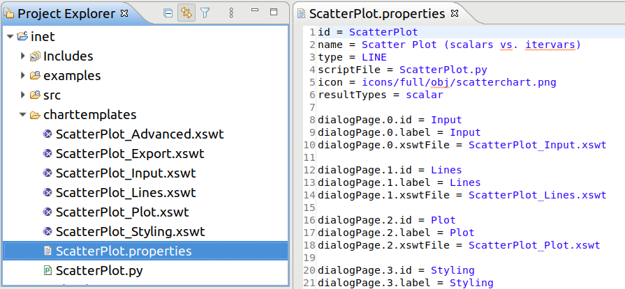
Fig. 168 An Exported Chart Template
You may want to tweak some properties (e.g., the descriptive name) of the saved chart template before use, but regardless, the new chart template is immediately available for use.
Parts of a Chart Template
A chart template consists of several parts, describing the initial contents of charts created from it: what kind of drawing widget it needs (Matplotlib or one of the native plot widgets), what script it executes, how its configuration dialog looks like, what types of result items it can process/show, and which icon should be used for it.
Namely, there are several files:
<name>.properties: This is the main file. It defines the name and other attributes of the chart template and references all other files by name. The syntax is Java property file.<name>.py: The Python file that contains the chart script.*.xswt: The dialog pages.
Note
Scripts and dialog pages can be shared by multiple chart templates.
Notable keys in the properties file:
id: Internal identifiername: Descriptive nametype:MATPLOTLIB, or one ofLINE,BAR, andHISTOGRAMfor native plotsscriptFile: The chart script Python fileicon: Icon file, e.g. in PNG formatresultTypes: One or more ofscalar,vector,parameter,histogram, andstatistics, separated by commasdescription: Long description of the chart in HTML formatdialogPage.<n>.id: Internal identifier of the nth dialog pagedialogPage.<n>.label: Label of the tab of the nth dialog pagedialogPage.<n>.xswtFile: XSWT file of the nth dialog page
Under the Hood
This section details the internal workings of the Python integration in the Analysis Tool. Its contents are not directly useful for most users, only for those who are curious about the technicalities or want to troubleshoot an issue.
Chart scripts are executed by separate Python processes, launched from the
python3[.exe] found in $PATH. This decision was made so that a rogue
chart script can’t make the entire IDE unresponsive or crash it. Also, it’s
possible to put resource or permission constraints on these processes without
hindering the IDE itself, and they can be killed at any time with no major
consequences to the rest of the Analysis Tool - for example, in the event of a
deadlock or thrashing.
These processes are ephemeral, and a fresh one is used for each refresh, so no interpreter state is preserved across executions. A small number of processes are kept pre-spawned in a pool, so they can be put to use quickly when needed.
If you wish to utilize virtual environments, start the entire IDE from a shell in which the environment to use has been activated. This way, the spawned Python interpreter processes will also run in that environment.
The level of flexibility offered by this arbitrary scripting unfortunately comes with its own dangers too. Note that the scripts running in charts have full access to everything on your computer without any sandboxing, so they can read/write/delete files, open graphical windows, make network connections, utilize any hardware resources, etc.! Because of this, make sure to only ever open analysis files from sources you trust! (Or open files from untrusted sources only on systems that are not critical.)
Communication between the Eclipse IDE and the spawned Python processes is done via the Py4J project, through an ordinary network (TCP) socket.
To avoid the CPU and RAM inefficiencies caused by the string-based nature of the Py4J protocol, bulk data is transferred in shared memory (POSIX SHM or unnamed file mappings on Windows) instead of the socket. Without this, binary data would have to be base64 encoded, then represented as UTF-16, which would be about 3x the size on top of the original content, which is already present in both processes. Data passed this way includes any queried results (in pickle format), and in the other direction, the data to plot on native plot widgets, or the raw pixel data rendered by Matplotlib.
Many other kinds of information, like GUI events or smaller pieces of data (like chart properties) are passed through the Py4J socket as regular function call parameters.